
Design Psychology

Design Shows Us What Matters
Before someone takes in a single word, design is already creating an impression—shaping where attention goes, what stands out, and how the experience feels before the message has even had a chance to speak.
Design Psychology
Design Shows Us
What Matters
Before someone takes in a single word, design is already creating an impression—shaping where attention goes, what stands out, and how the experience feels before the message has even had a chance to speak.
The Foundation
What Is Design Psychology?
Design psychology is the intentional application of what we understand about perception, attention, cognition, emotion, and behavior to the way an experience is designed.
Because every designed experience asks something of the person encountering it.
Where should I look first? What belongs together? What matters most? Does this feel familiar or confusing? Is there too much happening? Can I understand this quickly? Do I trust what I’m seeing? Is this worth more of my time? Where do I go next?
Design helps answer those questions—sometimes well, sometimes poorly, and often before we’re consciously aware we’re asking them.
That means spacing isn’t just empty space. Contrast isn’t just visual interest. Typography isn’t just a stylistic choice. The order in which information appears isn’t simply a layout decision.
Each can change the way information is noticed, interpreted, connected, and experienced.
And that extends far beyond websites.
It happens in the pacing of a video, the hierarchy of an advertisement, the way a museum leads you from one exhibit to another, the packaging you recognize from across a store, and the visual language that makes a brand feel familiar before you’ve read its name.
Design is answering questions whether the designer intended to answer them or not.
Design psychology is the practice of becoming more intentional about those answers.
Not to control what someone thinks.
But to create better conditions for attention, understanding, trust, and choice.
The Problem
Interest Doesn’t Guarantee Attention
Someone can genuinely care about what you have to say and still leave. Every interaction costs something—time, attention, mental effort, patience—and poor design makes that cost unnecessarily high.
Clutter forces people to sort through competing information. Weak hierarchy makes them figure out what matters. Dense formatting makes ideas harder to separate, while poor sequencing leaves the audience to connect thoughts that should have been connected for them.
None of those things necessarily make the underlying idea less valuable. They simply make that value harder to experience.
The more unnecessary work an experience asks the audience to do, the more expensive the information becomes to consume.
That doesn’t mean every experience should be effortless. Some ideas deserve concentration. Some should challenge us. The goal is to remove the friction that contributes nothing to the experience, so people can spend their energy on the idea itself.

High Friction
Attention – Competing Information
Too many elements ask for attention at once.
Hierarchy – Unclear Priorities
The audience has to determine what matters.
Effort – High Mental Load
The structure makes understanding harder than it needs to be.
Flow – Weak Momentum
Each step requires another decision about where to go next.

Low Friction
Attention – Clear Direction
Attention has somewhere to begin.
Hierarchy – Logical Progression
Information arrives in an order that makes sense.
Effort – Manageable Information
Ideas have enough separation to be understood.
Flow – Forward Momentum
Each step creates a natural path into the next.
Don’t make people work harder than the idea requires.
People should be able to decide that something isn’t relevant to them. But when something is relevant, the experience shouldn’t make them fight their way to the value.
The Bigger Picture
Every Experience Has To Earn The Next Step
Content strategy can reach all the way down to a word choice, edit, visual, or piece of music. But that doesn’t mean every decision is arbitrary.
Each one should help the content do something more effectively.

01 — ATTENTION
Give the Eye Somewhere to Go
Attention is limited, and design helps determine where it lands. Contrast, scale, position, imagery, movement, and visual hierarchy can make certain information more noticeable than everything around it.
The goal isn’t to make everything louder. It’s to establish priority. When every element demands attention, the audience has to decide for themselves what deserves it.
Good hierarchy gives attention a place to begin.

02 — EASE
Make The Flow Naturally
Once attention has somewhere to land, the experience needs somewhere to go. Spacing, grouping, legibility, information density, and familiar patterns can reduce the little moments of friction that interrupt understanding and momentum, and make people reconsider whether it’s worth it to continue.
The goal isn’t to rush people through the experience. It’s to create enough structure and clarity that each part naturally prepares them for the next.
Good design makes forward feel like the natural direction.

03 — UNDERSTANDING
Help the Story Make Sense
Information doesn’t arrive in a vacuum. What someone sees first changes how they interpret what comes next, and ideas become easier to understand when each one gives the next somewhere to land.
This is where hierarchy becomes storytelling. Design can establish relationships, separate concepts, reveal information in a useful order, and help someone build understanding as they move.
Don’t just organize the information. Organize the understanding.

04 — FEELING
Make the Experience Feel Like It Belongs
People don’t experience design as pure information. Typography, imagery, color, composition, pacing, familiarity, and aesthetic quality all contribute to how an experience feels—and whether it feels like it was made for someone like them.
This isn’t as simple as “blue creates trust” or “red creates urgency.” Context matters. Culture matters. Expectations matter. The brand matters. The audience matters.
The goal is coherence between what something says, who it’s for, and what it feels like to experience it.


05 — ACTION
Make the Next Step Feel Natural
A bright button can attract the eye. It can’t rescue an experience that never made sense.
By the time someone reaches an important decision, good design has already been doing much of the work: establishing relevance, building confidence, supporting comprehension, , and making the available paths understandable.
The CTA isn’t where conversion begins. It’s simply where the journey becomes visible.
Good design doesn’t push someone toward a decision. It makes the decision easier to understand.
Where To Start
Essential Design Psychology Articles
Explore the principles behind how people perceive, process, navigate, and respond to designed experiences—and how those principles can make communication clearer, more intuitive, and more effective.
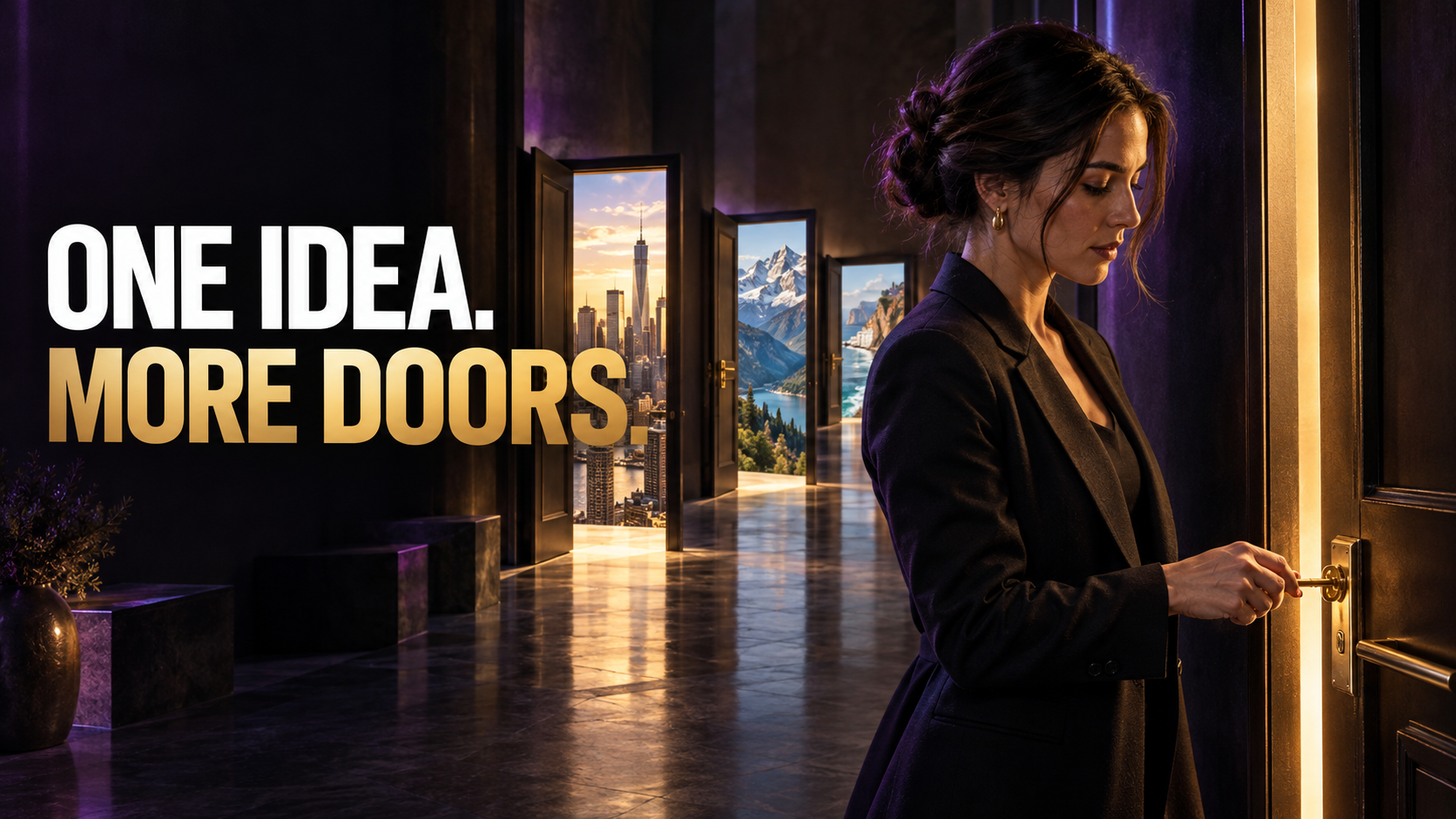
A content system is more than a repeatable publishing workflow. It connects expertise, strategy, source content, adaptation, distribution, audience response, measurement, and refinement so individual content efforts begin working together.
A content system is more than a repeatable publishing workflow. It connects expertise, strategy, source content, adaptation, distribution, audience response, measurement, and refinement so individual content efforts begin working together.
A content system is more than a repeatable publishing workflow. It connects expertise, strategy, source content, adaptation, distribution, audience response, measurement, and refinement so individual content efforts begin working together.
A content system is more than a repeatable publishing workflow. It connects expertise, strategy, source content, adaptation, distribution, audience response, measurement, and refinement so individual content efforts begin working together.
Our Perspective
How You Arrange the Pieces Shapes The Whole
Imagine a museum filled with extraordinary art.
You could hang every piece beautifully. Give each one enough space. Light it perfectly. Make every room stunning.
And still design a poor museum.
Because the experience isn’t only shaped by how beautiful each piece looks. It’s shaped by what you see beside it, what you saw before it, what receives greater emphasis, and what you’re prepared to understand by the time you reach it.
Museums curate relationships.
Artists from the same movement, period, place, or philosophy may be brought together so you can begin to see what they shared—and where they departed from one another. An especially influential artist may be given greater prominence, not simply because their work deserves a bigger wall, but because understanding their influence helps you understand the work surrounding them.
One room can establish the ideas that make the next room more meaningful. Movements can give way to their reactions. Similarities become visible through proximity. Differences become sharper through comparison.
Gradually, individual pieces stop existing only as individual pieces.
You begin to see the bigger picture.
Now imagine the same collection arranged primarily to look beautiful.
Every room could still be gorgeous. Every painting could still be perfectly lit. But if the relationships between them were ignored, much of the meaning would disappear. You would see the pieces without necessarily understanding how they fit together.
Beauty draws you in. Design reveals a bigger truth.
That distinction matters far beyond museums.
A website can contain all the right information and still fail to reveal the larger idea. A video can contain every important point and still tell the story in the wrong order. A presentation can look exceptional while leaving its audience to figure out how one thought relates to the next.
The best design doesn’t merely make information pleasant to look at. It uses sequence, proximity, contrast, hierarchy, pacing, and emphasis to reveal relationships—to help one idea prepare us for another and give important moments the weight they deserve.
Beauty and function aren’t competing priorities. Beauty creates attraction. Design gives that attraction somewhere meaningful to go.
And when the two work together, we don’t simply make individual pieces easier to experience.
We make the whole easier to understand.
FAQ’s
Common Questions About Design Psychology
Clear answers to common questions about how design influences attention, understanding, trust, and the way people experience information.
01 - What is design psychology?
Design psychology is the intentional application of what we understand about perception, attention, cognition, emotion, and behavior to the way experiences are designed.
That can influence a website, but it can just as easily influence how a video is paced, how an advertisement directs the eye, how a brand creates recognition, how information is presented, or how a story unfolds.
The medium changes. The underlying question doesn’t: How does the way something is designed change the way someone experiences it?
02 - Where is design psychology used?
Almost anywhere something has been intentionally designed for another person to experience.
A filmmaker uses pacing, composition, sound, editing, and visual emphasis to influence what an audience notices and feels. A brand uses typography, color, imagery, repetition, and consistency to create recognition and expectation. A website uses hierarchy, sequence, spacing, and interaction to help people understand and navigate information.
Even physical environments do it. Museums, stores, packaging, presentations, signage, products, and architecture all make decisions about what people encounter, in what order, and with what emphasis.
Design psychology isn’t tied to a medium. It’s concerned with the person experiencing it.
03 - Why does design have such a strong effect on first impressions?
We begin processing an experience before we’ve carefully evaluated everything it contains.
Composition, imagery, sound, movement, visual complexity, familiarity, production quality, and other cues can establish an initial sense of what we’re encountering remarkably quickly. Those impressions can influence whether something feels relevant, credible, interesting, confusing, familiar, or worth further attention.
That doesn’t mean first impressions are permanent or that design can override reality. It means the experience begins before the explanation does.
04 — How does design influence attention?
Attention is selective. At any moment, more information is available than we can meaningfully process at once.
Design can create priorities within that competition. In a video, that might come from movement, framing, a cut, a pause, music, or a change in pace. In a static composition, it might come from contrast, scale, imagery, position, or whitespace. In an environment, it could be lighting, proximity, orientation, or movement through space.
The point isn’t to make everything more stimulating. Quite the opposite.
If everything asks for attention, nothing has been given priority.
05 — Can design make difficult ideas easier to understand?
It can make them easier to experience and process without pretending the ideas themselves are simple.
A visual can make an abstract relationship tangible. An example can give a concept somewhere concrete to land. Editing can reveal information in a useful sequence. Proximity can make relationships visible. Pacing can give an important thought enough time to register before the next one arrives.
Good design doesn’t have to remove complexity. It can give complexity structure.
06 — How do emotion and aesthetics fit into design psychology?
They’re fundamental to it.
People don’t encounter experiences as purely rational information processors. Music can change the emotional meaning of a scene. An image can make an idea feel more immediate. Typography can contribute personality. Materials, color, lighting, rhythm, composition, and production quality can all influence how an experience feels.
But those effects depend heavily on context. There isn’t a universal dictionary where one color, font, song, or visual style always creates one emotion.
The more useful goal is emotional coherence: making what something says, how it feels, and who it’s for belong to the same experience.
07 — Can design psychology be manipulative?
It can be. Design influences what people notice, how information is interpreted, what feels important, and how easily someone can move toward a decision. Those tools can be used dishonestly.
But manipulative design is ultimately bad design.
A business doesn’t benefit simply because someone clicked a button or completed a purchase. It benefits when the right customer understands what is being offered, believes it will genuinely help them, has a good experience with that decision, and leaves with greater trust in the business than they had before.
Cheap tactics can sometimes produce cheap conversions. But if someone later feels pressured, misled, or tricked, the business inherits the cost: diminished trust, fewer repeat purchases, weaker recommendations, poor word of mouth, and a reputation that makes every future relationship harder to earn.
Good design should work in the opposite direction.
It should help a business communicate its value honestly and help people determine whether that value is actually relevant to them. The right customer should find it easier to understand why the offer fits. Someone who isn’t the right fit should be able to recognize that just as clearly and move on without having their time wasted.
That isn’t a lost conversion. That’s the system working.
Because the real goal isn’t to extract the greatest possible number of actions from an audience. It’s to create the conditions for good decisions—and build the kind of trust, reputation, relationships, and community that can benefit both the customer and the business for a long time.
Good design doesn’t trick people into saying yes. It helps the right people understand why they would.
08 — What makes design psychology effective?
Not knowing a long list of psychological principles.
The real skill is understanding which principle matters, for whom, in what context, and why.
A technique that helps one experience can hurt another. Faster pacing can create energy or destroy a moment that needed room to breathe. More contrast can establish hierarchy or create visual noise. Familiarity can make something easier to process or make it easier to ignore.
Design psychology becomes useful when principles stop being treated as tricks and start becoming reasoning tools for making better creative decisions.
Explore The Topic
Explore Our Library of Design Psychology Articles
Explore our latest thinking on how design shapes attention, understanding, emotion, trust, and action—and how those principles can be applied across websites, video, branding, content, and other designed experiences.
No Results Found
The page you requested could not be found. Try refining your search, or use the navigation above to locate the post.
Explore Other Topics
Content Systems
Funnels & Conversions
Design Psychology
Branding & Audience
Search & Discovery
AI Strategy
Content Strategy
Content Systems
Funnels & Conversions
Branding & Audience
Search & Discovery
AI Strategy
Have a Project in Mind?
Let’s Talk About What’s Next
If you’re thinking about how content could play a larger role in your business, let’s talk about what you’re building and where you want it to go.